




Written by: Aaron Rovner, Founder, Saas Hero | Last updated: September 3, 2026
Key Takeaways
- Effective SaaS landing pages follow a clear persuasion flow from awareness to action, with each section serving a defined psychological role.
- Headline copy drives the largest conversion lifts. Outcome-focused headlines that name the buyer’s problem consistently beat generic category claims.
- Structure shifts by business model. Self-serve pages focus on frictionless sign-up and product visuals, while sales-led pages expand the problem story and use qualification-focused CTAs.
- Four structural issues cause most conversion losses: buried CTAs, generic headlines, weak or missing social proof, and navigation that pulls visitors away.
- Get a free landing page audit from SaaSHero and pinpoint where your current structure leaks conversions.
The Core Framework: 10 Essential Sections of a High-Converting SaaS Landing Page
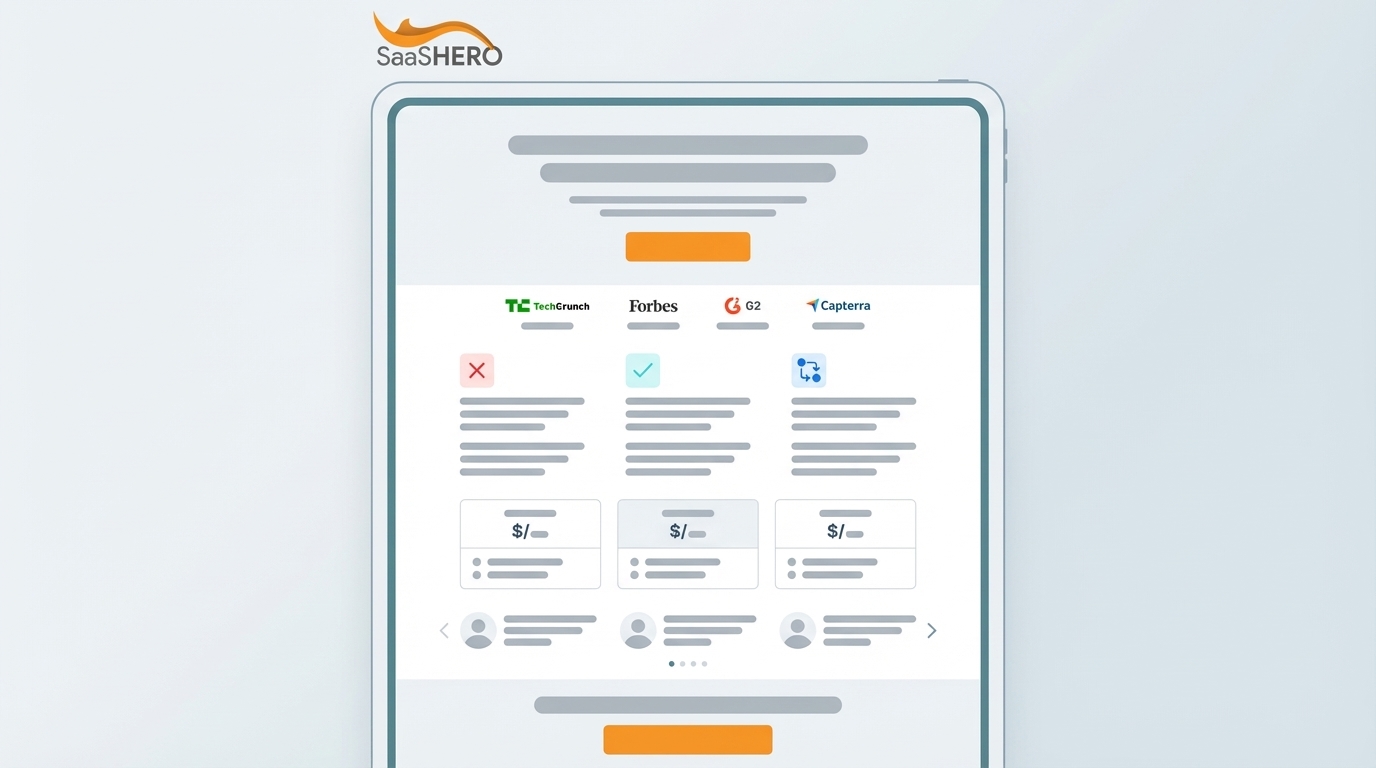
An effective SaaS landing page uses a top-to-bottom persuasion flow that moves visitors from awareness to action. The page usually includes a hero section, social proof, problem and solution, how it works, features, pricing, FAQ, and a final call to action.
Each section earns the next by resolving a specific objection or anxiety before the visitor consciously names it.
The 10 sections of a high-converting SaaS landing page are:
- Minimal Navigation
- Hero Section
- Initial Social Proof
- Problem & Solution
- How It Works
- Features & Benefits
- Deep Social Proof & Case Studies
- Pricing Preview
- FAQ
- Final CTA & Footer
This structure mirrors what AI Overviews now recommend as the standard anatomy of a SaaS landing page. Execution through psychology, copy, and ordering determines conversion rates. A list of sections only becomes a strategy when you understand the rationale behind each placement.
Section-by-Section Playbook: The Psychology and Copywriting Behind Each Block
Hero Section: The First 5 Seconds Decide Everything
The hero section manages cognitive load and decides whether visitors stay or leave. It must answer “Is this for me?” before any other question appears. Every element competes for limited attention, so anything that does not answer that question wastes it.
The copy formula is simple: Headline = Outcome + Pain Point. Subheadline = Mechanism. CTA = Single, low-friction action.
Data from SaaSHero’s work on B2B SaaS landing pages shows that headline copy is the most powerful conversion lever. A headline that names the buyer’s problem and desired outcome beats category claims like “#1 SaaS Platform” in every test. The same logic applies to the visual. Show the product in action with a screenshot, GIF, or short video, instead of an abstract illustration.
Shop Boss, an automotive repair shop management platform, saw a 305% increase in conversion rate after working with SaaSHero. The headline rewrite created the largest lift. The original page led with a category claim. The new version led with the specific operational problem shop owners face every day.
Social Proof: Borrowing Trust at the Moment of Skepticism
Social proof lowers perceived risk at the exact moment visitors wonder whether to trust you. Placed right after the hero, logo bars, aggregate ratings, and customer counts answer “Who else trusts this?” before visitors invest effort in evaluating the product.
The copy approach favors specificity over volume. “Trusted by 500+ repair shops” beats “Trusted by industry leaders” because the claim feels concrete and verifiable.
Use three tiers of social proof at different points on the page:
- Logo bars near the top for instant recognition
- Metric-based proof in the middle, such as customer counts, revenue influenced, or payback periods
- Detailed testimonials and case studies near feature claims deeper in the page
Problem & Solution: Naming the Pain Before Presenting the Cure
Loss aversion, identified by Kahneman and Tversky in their foundational work on Prospect Theory, describes a phenomenon where people feel the pain of loss approximately twice as strongly as the pleasure from an equivalent gain. Naming the painful status quo on a landing page activates avoidance motivation. The solution starts to feel necessary instead of optional. Neuroscience research published in Nature Communications in 2026 confirms that aversion learning produces durable behavioral and synaptic changes, supporting the principle that negative-outcome framing shapes decision-making at a biological level.
Use a simple copy pattern. Describe the frustrating daily reality, the “before” state. Then introduce the product as the direct path to the “after” state. Write the problem section in the buyer’s vocabulary and context. Sales-led SaaS companies should invest heavily here, because the visitor is evaluating an ongoing relationship and not a one-off tool.
How It Works: Reducing Perceived Effort
Implementation anxiety quietly blocks conversions. Visitors may understand the value but still hesitate if they cannot picture adoption. A three-step breakdown makes adoption feel manageable by turning a complex process into a clear sequence.
Keep the structure to three steps at most, such as Connect or Install, Configure or Integrate, and See Results. Pair each step with an icon or short visual. Longer sequences signal complexity, even when the labels sound simple.
Features & Benefits: Outcome-Driven Specificity
Feature grids help analytical buyers decide, but only when each feature connects to a measurable outcome. A feature list alone describes the product. A feature list tied to outcomes describes how the buyer’s workday improves after purchase.
Use this pattern: Feature → Benefit → Proof. For example, “Automated workflows → Save 10 hours per week → Customers report 15+ hours saved weekly within 30 days.” Present this in a scannable grid with short blocks, and alternate image-and-text rows for your main differentiators.
Pricing: Transparency as a Trust Signal
Pricing anxiety often becomes the final major objection before a visitor acts or leaves. Clear tiers show confidence in your value and reduce the friction of an unknown commitment. Display simple tiers with a monthly and annual toggle.
Add risk reducers such as “No credit card required,” “Cancel anytime,” and “14-day free trial.” Each phrase removes a specific objection without forcing the visitor to ask.
FAQ: Answering the Objections Visitors Still Hold
The FAQ section serves visitors who remain undecided after reading the main content. They arrive here to resolve lingering doubts. Address real objections such as security, migration, implementation time, and support quality.
Use an accordion layout with six to eight concise questions written in the buyer’s voice. Answer each concern directly and clearly.
Final CTA: Turning Attention into Action
The recency effect means the last message on the page sticks longest in memory. Use the final section to repeat your core promise and primary action. “Start converting more trial users today” tends to beat “Sign up now” because it restates the outcome, not just the click.
Reinforce the same risk reducers you used in the pricing section. This combination removes the last pockets of hesitation.
Model-Specific Structures: Self-Serve vs. Sales-Led
The ideal SaaS landing page structure depends on your business model. The same 10 sections still apply, but their order, emphasis, and copy focus change based on whether you want a free trial sign-up or a demo request.
Self-serve SaaS pages that drive free trials focus on a frictionless path to sign-up. Product-led value demonstration dominates. Interactive demos, product tours, and “see it in action” visuals appear high on the page. Social proof highlights user count and time-to-value metrics. The CTA, usually “Start Free Trial,” repeats throughout the page, and every barrier between arrival and account creation gets removed.
Key characteristics of self-serve pages:
- Product visuals and interactive demos placed high on the page
- Social proof centered on user volume and speed-to-value
- Minimal form fields, often a single email field
- Prominent pricing section with a clearly marked free tier
Sales-led SaaS pages that drive demos focus on lead capture and qualification. The problem story and social proof carry more weight, because the visitor evaluates a partnership as well as a product. The CTA is “Book a Demo,” and the form includes fields that qualify by company size and use case. SaaSHero’s experience shows that sales-led pages are often easier to improve, because qualification happens on the call. The page’s job is to create a qualified conversation.
Key characteristics of sales-led pages:
- Expanded problem section placed earlier in the flow
- Case studies with named companies and specific revenue outcomes
- Qualification fields in the form, such as company size, use case, and role
- Social proof weighted toward enterprise logos and named testimonials
Common Structural Mistakes That Kill Conversions
Most SaaS landing page failures come from structure, not visual design. Four recurring mistakes cause most conversion losses across the pages SaaSHero has audited and rebuilt.
- Burying the CTA below the fold without repetition. A single CTA at the bottom of a long page loses every visitor who never scrolls that far. Fix this by repeating the primary CTA at least three times: in the hero, mid-page, and final section.
- Generic headlines that describe the product instead of the problem. “Full-service marketing platform” tells visitors what the product is. It does not show whether it solves their problem. Fix this by leading with the outcome and pain point. “Stop managing your marketing agency” outperforms “Full-service marketing agency” because it names the buyer’s frustration first.
- Missing social proof above the fold. Visitors who reach the hero with no trust signal have little reason to keep reading. Fix this by placing a logo bar or key metric right after the hero, before visitors invest effort in evaluating the product.
- Navigation that offers escape routes. Every navigation link on a landing page creates an exit path. Fix this by removing all navigation links except the CTA, because every click to the blog or about page pulls attention away from conversion.
About SaaSHero and This Playbook
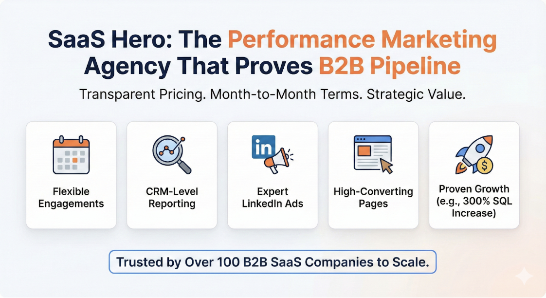
SaaSHero acts as the outsourced inbound growth team for B2B SaaS companies. One team owns paid media, creative, landing pages, and CRM-attributed reporting. Full-time designers and copywriters design, build, and test landing pages in-house.
Optimization runs against CRM revenue data such as qualified pipeline, lifecycle stage, and closed revenue. This approach makes landing page testing meaningful, because the page improves for buyers, not just for people who like filling out forms.
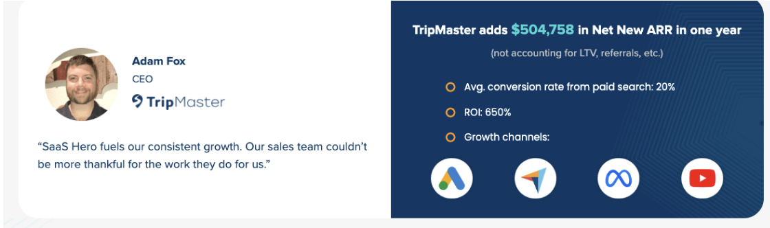
SaaSHero has managed over $60M in lifetime ad spend and has served more than 100 B2B SaaS companies. The team holds Google Premier Partner status, placing it in the top 3% of agencies, and ranks #20 out of roughly 6,000 agencies on G2. Results include the 305% conversion rate lift for Shop Boss mentioned earlier, $504,758 in Net New ARR for TripMaster at 650% ROAS, a 10x reduction in cost per lead for Playvox with a 163% increase in lead volume, and an 80-day payback period with 5,000+ new customers for TestGorilla.
See where your current landing page structure is losing conversions with a free audit from SaaSHero.
For teams ready to go deeper on implementation, SaaSHero’s guides on How to Design High-Converting B2B SaaS Landing Pages and Landing Page A/B Testing for SaaS: Complete Guide 2026 cover the tactical layer in detail.
Frequently Asked Questions
What makes a SaaS landing page effective?
An effective SaaS landing page guides visitors from awareness to action by resolving objections in a logical order. The hero clarifies who the product is for, social proof builds trust, the problem story activates urgency, and the final CTA restates the core promise. For a full breakdown of the 10 sections and their roles, see the framework above.
How do you structure a SaaS landing page for conversions?
Structure the page as a conversion narrative. Start with an outcome-driven headline that names the buyer’s problem and desired result. Follow with immediate social proof, then articulate the problem before presenting the solution. Reduce friction with a three-step “how it works” section, and repeat your primary CTA in the hero, mid-page, and final sections.
Remove navigation links that do not support the main action. Write every section in the buyer’s vocabulary. Test the headline first, because it consistently produces the largest conversion lifts.
What is the difference between self-serve and sales-led landing page structure?
Self-serve pages focus on a fast, low-friction path to sign-up. Product demos, tours, and speed-to-value metrics appear early, forms stay short, and “Start Free Trial” repeats as the main CTA. Sales-led pages focus on lead quality. They expand the problem story, highlight named case studies and revenue outcomes, and use forms with qualification fields.
The same 10-section framework applies to both models. The emphasis, copy focus, and section order shift based on what the visitor must believe before taking action.
How long should a SaaS landing page be?
A SaaS landing page should be long enough to answer every likely objection. For most products this falls around 400 to 800 words, with a median near 620 words. Some sources suggest 500 to 700 words for readability, and pages up to about 1,200 words can work for high-consideration products.
Shorter pages suit self-serve trials where the ask is low-friction and the product can be experienced immediately. Sales-led pages usually need more depth for problem articulation, case studies, and FAQ content. The right length is the point where major objections are addressed and the visitor has a clear reason to act.
Conclusion: Structure Is Strategy
Your landing page structure functions as a conversion narrative. Each section must earn the next by resolving a specific psychological objection before the visitor names it.
When structure, copy, and psychology align, and when one accountable team owns the page from concept through testing and optimizes against CRM revenue data, conversion rates follow. See how SaaSHero structures landing pages that turn paid traffic into pipeline and apply the same approach to your own pages.