Marketing and graphic design are two peas in a pod. Even the best marketing campaigns can come to a screeching halt if there isn’t carefully, professionally and well thought out creative to support them.
Unfortunately, early stage SaaS founders with no design chops are usually forced to take one of the following routes in order to achieve the creative bliss they’re after:
A) Hire a professional graphic designer gets expensive, quick
B) Scour the internet to find images they can borrow for their campaigns possible legal issues and no creative control
C) Purchase expensive and confusing software and try to learn it quick huge knowledge gap usually leading to a frustrating experience and wasted cash
Over the years, I found myself bouncing back and forth between all 3 of these scenarios. It totally sucked, and, for a person who prides himself on being pretty resilient, made me feel a bit helpless.
There’s nothing I hated more than having to delay a great campaign idea (or what I thought was a great idea ) because I had to rely on someone else for ad creative.
Luckily, the internet has once again come to the rescue and provided marketers who lack in the graphic design department with a wealth of free (and almost-free) online tools to help create amazing marketing collateral without having to shell out big bucks or lots of time.
Good news for ambitious, bootstrapping startup founders!
In the sections below, I’m going to show you exactly what tools I’ve used in the past and the processes I’ve gone through to create professional, high converting ads for clients that look like they could have been designed by real graphic artists.
I even put my designer hat on and made a short video for you to watch to see exactly how I created a new ad from scratch using some of my favorite design tools and ran it on Facebook!

But before we jump into the details on each graphic design software, I think it’s important to cover a few items that will help lay the groundwork for creating the perfect ads.
Find Inspiration
I’m a firm believer in not reinventing the wheel when you don’t have to. And in this case, tens of thousands of advertisers from every industry imaginable are coming up with unique styles of creative to inspire us!
If you’re in the B2B space like we are, I’d suggest checking out this post from AdEspresso to get the creative juices flowing.
However, if you aren’t lucky enough to find a resource that perfectly suited for your needs, here are some other options.
- Turbo Ad Finder Google Chrome Extension
The Turbo Ad Finder will turn your desktop Facebook feed into only ads (as if you didn’t
have enough ads there already…).
Basically, it will suppress all regular posts from the people / pages you follow on FB and just display sponsored posts.
Check out the gif below to see an example of how it works.
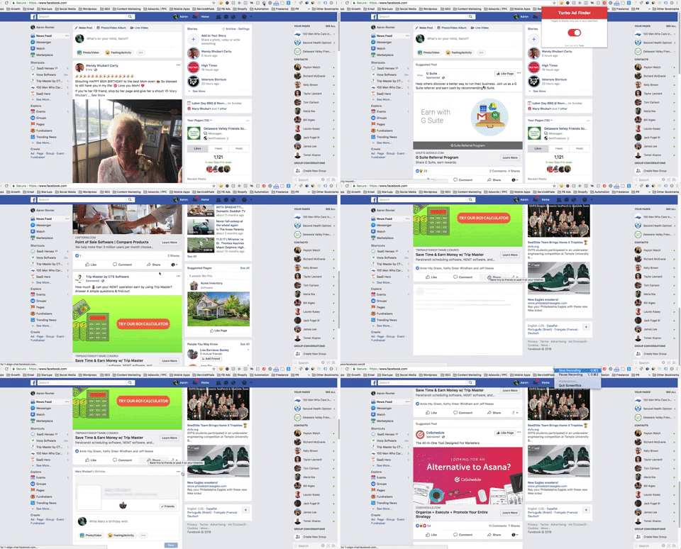
Fun Fact: the pic of the 85 year old woman at the top of my news feed is my wife’s grandmother on her birthday. Happy bday, Mommom!
In just this short clip you see so many different design styles. Gold, Jerry. Gold!
- Info and Ads Section on Facebook Business Pages
In light of the outcome of some recent election results, it appears as though there may have been some significant voter influence via the use of Facebook advertising (that will be the only semi-political comment of this post, btw).
In lieu of that, our pals at FB decided it would be prudent to make all active ads from any advertiser on their platform easily accessible to any FB user.
What does that mean for you? It means that if you visit any business page on FB, you’ll see a new item on the left hand menu labeled Info and Ads. Click it and get access to all of your competitors current ads.
How’s that for insider access?
Pro Tip: Don’t just limit yourself to looking at your competitors ads. Check out other companies outside of your vertical who are successful to see how their creative is designed. This exercise isn’t just about copying other players in your space, it’s about creating beautiful, compelling ads
The last (and probably most obvious) thing you may want to try is just conducting a quick search on Google for something like ad inspiration. Apparently, we’re not the only ones with this problem and there’s a bunch of helpful content out there.
Moving On
Now that you’ve found tons of graphic design examples and have a feel for the type of creative you want to produce, it’s time to get your assets in order. Specifically, a high quality version of your logo and the color scheme.
Creative Assets High Resolution Logo
The first thing you’ll need to do is get a high resolution version of your logo. Keeping a consistent brand presence on your ad creative is critical, so having the logo in the right format is very important.
If you worked with a graphic designer to create your logo, chances are you’ll already have the file in a high res format. If that’s the case, feel free to skip along to the next section.

In the event you don’t have the high res version of your logo, try grabbing it from your website by right clicking and selecting save image as. Most of the time, you’ll get a pretty clear version that will be good enough to use for ad creative especially, because the logo isn’t usually the focal point of the design anyway.
**It’s important to note that logo’s often have a solid-colored background which will need to be removed. A dead giveaway for a logo where the background is removed will be a checkered gray background. Take a look at the image below for an example. We’ll cover a ridiculously simple way to remove the background from any logo under the Lunapic section a little further down.**
Color Scheme
Most companies have a specific color that is present in their website and marketing materials. For example, Facebook uses their very recognizable blue color which appears in several locations throughout the website and app (logo, header, buttons, links, etc.).
In order to keep a consistent brand design, it’s critical to know the hex code of that easily identifiable brand color.
What’s a hex code?, you ask?
Without getting too technical, a hex code is a 6 character string of numbers and letters following a # that signifies a specific color. Practically every free and paid online graphic design software supports the use of hex codes and it makes it super easy for ad designers to ensure they’re using an identical color scheme for all of their ad creative.
Now, you’re probably asking where do you find the hex code on a website? Simple! Let me show you.
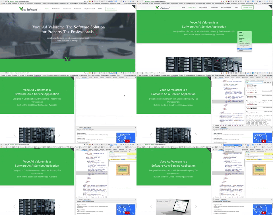
Go to any website and find a section that has the color you’re looking to use for your ad designs, right click and then select Inspect.
Once you do that, your screen will split in half…one half will be the website you’re looking at, the other half will be the HTML that the site was built with.
For you non-technical startup leaders reading this, don’t let this scare you off! At first, looking at this code can seem a little intimidating, but you’re looking for one specific thing…background-color.
Everything else is just noise.
There’s even a text box labeled Filter in the top right hand side of the inspect section. Type in background-color and it will instantly pull up the hex code you’re after. Once you have the hex code, drop it in a note or some easily accessible text file on your computer so you can reference it quickly when you need it.
Here’s a gif showing exactly how I pulled the hex code from a client’s website.
Now that you have all of the assets you need to create awesome looking ad creative, let’s jump into the graphic design tools you’ll need to bring your projects to fruition.
The Tools for the Job
If you’re trying to find free graphic design software, you’ll have no trouble coming up with a ton of different options. However, in my opinion, you really only need 3 to create amazing looking ads.
Canva, Bannersnack and Lunapic.
I’ll go through each one of them individually to explain how they work and then show you some examples of how I use each platform.
Lunapic
Lunapic does a lot of cool things, but I pretty much only ever used it to remove backgrounds from logos and other images.
As I mentioned in the previous section, it’s a pretty common occurrence to come across logos that have a solid-colored background which will look super amateur when designing what are supposed to be professional looking advertising creative.
This is why Lunapic is such a valuable tool for novice graphic designers. Simply, upload the logo with the solid-colored background, select Transparent Background under the Edit menu, then literally click anywhere on the background to remove it.
Hit save and you’re off to the races. As always, take a look at the example below.
Canva
Canva is the online design studio for people who don’t really know how to design.
It’s especially awesome because a) they have a ton of pre-designed layouts, stock images, objects, shapes and more to choose from in dozens of different dimensions and for different use cases (e.g. Facebook ad, blog header, postcard, etc.) and b) they have a super powerful free version.
Here’s an example of some of the preloaded design formats Canva offers
The process I used Canva for was to find specific design assets to use for creating ads (I used Bannersnack to actually create the final ad itself, but it’s totally possible to design the entire thing on Canva, too).
Those assets can be stock images, but more often than not, I was looking for specific illustrations that would help me get my point across in the ad I was designing.
For example, most of my clients offer business software developed to help their customers automate many parts of their daily tasks and reduce the amount of manual work normally needed.
In short, the software we’re advertising is designed to save time and increase revenue.
Pretty simple.
What image best illustrates time? How about a clock? What image best illustrates revenue? How about cash?
Bada bing, bada boom.
Canva has dozens of illustrations of both clocks and cash to choose from. Many are free, and there are also quite a few paid options they offer for just a measly dollar. There’s literally never been an easier way to find royalty free, professionally designed illustrations and images to use for ads than Canva.
Check out the image below to see what happens when you search for clock on Canva…you find a ton of clocks that you can download for free.
I’ll spare you a detailed example of what happens when you search for cash. You’re pretty smart. You can figure it out.
NOTE: If you’re using Canva to download image assets to use in another platform, you’ll most likely need to use custom dimensions for the size of the image. For example, standard Facebook ad images are 1200×628 px, but if you just want to download a picture of a clock that will be a part of a Facebook ad, then you may want to resize to something like 300×300 px. To do this, you’ll click File from the menu, select Change dimensions, then select Use custom dimensions
Bannersnack
Of the three tools we’ve looked at so far, Bannersnack is the only one that requires a paid membership to use. The good news is that for the base membership it’s only $12/month which is more than worth it for such a valuable graphic design tool.
Just for conversations sake, a good graphic designer may charge between $150 $300 for a set of 3 custom banner ads. Over the course of a year with Bannersnack you’ll only pay $144 and you can literally design hundreds of super effective pieces of ad creative.
Pretty good deal if you ask me.
Ok, enough about money. Let’s get back to making some ads!
The reason I like Bannersnack so much over the other similar design software options out there is the customizable, predesigned ad layouts and the gradient color schemes they offer (gradient colors always seem to pop more than ads with solid colored backgrounds, in my opinion).
They also focus strictly on creating ads for digital campaigns.
Canva is more like a mile wide and an inch deep when it comes to specific graphic design use cases.
Also, Bannersnack, like Canva, allows you to upload your own images to use for creating banners. That way, you can take, say, an illustration or 2 you downloaded from Canva (re: clock and cash) and upload them to Bannersnack to use for the final version of your ad.
At this point, I think it’s best to cut the chit chat and show you exactly how to use Bannersnack (along with Canva and Lunapic) to create a high quality, professional looking ad that clearly compliments your ad messaging.
As I mentioned at the beginning of this post, I even used the ad I created in the video in a Facebook campaign for a real client. Watch it below (it starts at the 9:57 mark, right when I get into Bannersnack).
For those of you too anxious to watch me create the ad in the video, just look below to see the finished product (but you should really just watch the video below to get a step-by-step guide on how to use Bannersnack and tie together the entire creative process!).

