





Written by: Aaron Rovner, Founder, Saas Hero | Last updated: September 4, 2026
Key Takeaways for Stronger B2B Ad Performance
- B2B ad design works best when creative speaks to specific buyer pain points with emotional weight instead of generic feature lists.
- Visual hierarchy, platform-native formats, and the one-idea rule decide whether an ad earns attention in the first 400 milliseconds.
- Social proof and verifiable data points provide the credibility B2B buyers need before they risk career capital on a new vendor.
- A disciplined 3-3-3 testing framework of three concepts, three variations, and three hooks lifts CTR and pipeline contribution while slowing creative fatigue.
- Ready to stop guessing and start converting? Talk with SaaSHero about owning your paid acquisition through creative, testing, and ongoing improvement.
Why Your B2B Ads Are Underperforming
In 2026, platforms handle targeting, bidding, and placement. Creative has become the main lever of differentiation. Yet most B2B ads still look identical: stock photos of handshakes, feature lists, and “Learn More” buttons that could belong to any competitor in the feed.
According to a 2024 LinkedIn and Magna study, B2B ads perceived as creative are 40% more likely to be considered for purchase by business decision-makers, with emotional appeal being one of several creative attributes, and creative accounts for up to 70% of campaign performance, ahead of targeting, bidding, and budget allocation. Despite this, 77% of B2B creative fails to register emotionally or create long-term impact.
This guide gives marketing leaders a decision-support framework when ads are running but results disappoint. It covers the strategic case for emotional creative, the messaging and design principles that drive action, platform-specific playbooks, and a testing framework for continuous improvement.
See how SaaSHero can run your paid acquisition end to end with an in-house team of designers and copywriters.
The Case for Creative: Why Emotion Beats Features in B2B
B2B buyers are human, and humans decide emotionally and justify rationally, even when the purchase is for work. Gerald Zaltman of Harvard Business School found that roughly 95% of cognition takes place unconsciously in the emotional brain, so purchase decisions are largely set before rational justification begins.
Emotion matters even more in B2B than in B2C because the stakes are higher. B2B buying is driven by three emotional factors that rarely show up in consumer purchasing: career risk, organizational politics, and implementation anxiety. Career risk dominates, because buyers face personal consequences for championing a tool that fails to deliver.
Loss aversion is amplified in B2B contexts, where a bad purchase costs money, time, credibility, and potentially team morale. The old saying that nobody ever got fired for buying IBM captures this dynamic. IBM represented the safest choice.
The implication for ad design is clear. Creative must acknowledge the buyer’s emotional reality. It should speak to fears such as choosing wrong or looking bad internally, and to aspirations such as becoming the hero who found the right solution. Stories carry that emotional load more effectively than feature lists.
Pain-Point Messaging: The Foundation of High-Converting B2B Ads
Message resonance comes before design. The strongest B2B ad messaging targets specific customer pain points instead of generic corporate claims. B2B messaging prioritizes credibility, specificity, and risk reduction, using phrases like “reduce churn by 23%” or “cut onboarding time from 6 weeks to 3 days.”
The working formula: “We know [specific pain point] is hurting your [specific metric]. Here is how to fix it.”
Before and after examples:
- Before: “Acme Software: Enterprise-grade solutions for modern businesses.” After: “Your agency is burning budget on ads that do not convert. Here is how to fix it in 30 days.”
- Before: “CloudSync: The leader in cloud data synchronization.” After: “Stop losing revenue to data silos. CloudSync unifies your customer data in real time.”
The message should speak to the buyer’s specific operational pain, not to broad category claims. For VPs of Marketing, that might mean the pain of reporting that fails to answer board questions. For CTOs, that might mean the pain of integration debt.
Visual Hierarchy: Design Principles That Drive Action
Once the message resonates, design must guide the eye. Visual hierarchy controls what viewers notice first, second, and third in your ad.
The F-pattern and the one-idea rule. The F-pattern was first documented by the Nielsen Norman Group through eye-tracking research. In text-heavy ads, readers scan the full first line, then a shorter second line, then move vertically down the left edge. They catch only the first two or three words of each subsequent line. The first line must contain the hook, and each line should start with the most important word.
Five design principles that drive action:
- One idea per ad. When you try to communicate multiple messages, clarity disappears. Each ad should make one clear point.
- Contrast creates hierarchy. A small, bright CTA button commands more attention than a large, dull one. Use a minimum contrast ratio of 4.5:1 for text.
- Whitespace signals importance. The most important element should have more whitespace around it than anything else, following the Rule of Isolation.
- Directional cues guide attention. If a person in your ad looks toward the CTA, viewers follow their gaze. Converging lines create a visual funnel.
- Mobile-first always. Over 85% of social media ad impressions are delivered on mobile devices. On narrow screens, F and Z patterns compress into a single vertical sequence, and the CTA must appear much earlier in the scroll than on desktop.
The Squint Test: Blur your vision or zoom out until text is unreadable. If the CTA is not one of the first three things you notice, the hierarchy needs work.
Platform-Specific Design Playbooks: LinkedIn, Google, Meta
These design principles only drive performance when adapted to each platform’s native conventions. Each platform has its own design language, audience expectations, and technical specifications. The table below summarizes key specs; every data point is sourced inline in the sections that follow.
| Platform | Top Formats | Recommended Image Sizes | Video Length | Key Design Principle |
|---|---|---|---|---|
| Single image, carousel, document, Thought Leader Ads | 1080×1080 (square), 1080×1920 (vertical) | Under 30s awareness; up to 90s retargeting | High-contrast color blocking, native-feel design | |
| Google Display | Responsive display ads (RDAs), static banners | 1200×628, 1200×1200, 900×1600 | N/A (static primary) | Billboard simplicity, one message and one CTA |
| Meta | Short-form video, UGC-style, carousel | 9:16 vertical (Reels/Stories), 1:1 square (feed) | 15–30s primary | Pattern interrupt, emotional trigger in first frame |
LinkedIn: Professional, Clean, and Native
LinkedIn is where B2B buyers research solutions and build professional credibility. Design should feel native to the platform, professional without sliding into corporate-boring.
Format choice matters on LinkedIn. Thought Leader Ads deliver 6.4x higher CTR than single image ads and 77% cheaper landing page clicks, based on ZenABM data from 2,828 ads across 211 companies. Carousel ads produce approximately 2x the CTR of single-image ads.
Sound-off viewing shapes video design. Up to 80% of LinkedIn videos are watched without sound, so burned-in captions are essential. Show the most important content in the first 10 seconds. The first line of copy must hook within 150 characters, the “See more” cutoff. Lead with a specific claim instead of a generic statement.
Google Display: Minimalist Billboard Style
Responsive display ads generate a 28% higher CTR than static banners. Upload at least five images, five headlines of 30 characters, and five descriptions of 90 characters to give Google’s machine learning room to improve performance.
Including multiple CTAs on a display ad can reduce click-through rates by up to 25%. Keep one message, one CTA, and maximum contrast.
Meta: Bold, Motion-Rich, and Scroll-Stopping
Meta’s algorithm rewards creative that earns engagement. Design must stop the scroll in the first frame. Attention allocation decisions happen within 400 milliseconds of visual exposure, so the emotional trigger belongs in the first frame.
The UGC-versus-studio tradeoff depends on your goal. UGC-style content lifts CTR by 20–35% for consumer brands, while studio creative often wins on brand recall for B2B. For B2B, authenticity means intentionality rather than low production value. A “lo-fi” video shot in a professional studio with strong lighting and audio will outperform a shaky cell phone video for a Series C SaaS brand.
Vertical formats require thumb-aware layout. Place the CTA in the lower-third thumb zone so viewers can act without shifting grip.
Social Proof and Data in Creative: Credibility That Converts
B2B buyers need proof before they commit. Adding customer testimonials, review counts, client logos, and trust badges to key pages typically improves conversion rates by 10% to 30%.
Effective social proof integration:
- Customer logos in a subtle strip at the bottom of the ad, rather than as the hero element.
- Specific, verifiable data points: “10x ROI” or “Reduced onboarding time from 6 weeks to 3 days” carry weight when presented with context. A data point without context looks like hype.
- Testimonial quotes with attribution: “Our conversion rate increased by 47% within three months” followed by name, title, and company.
- Case study results as the ad’s headline: “How [Client] cut CAC by 40% in one quarter.”
Social proof works hardest when it is emotionally specific. “50,000 customers” activates mild belonging. “50,000 companies that finally fixed their attribution” activates belonging and hope together. Emotional specificity in social proof determines how strongly it resonates.
A Testing Framework for Creative Concepts
Most B2B teams test creative randomly, without a hypothesis or a structured process. A disciplined framework turns testing into a repeatable system.
The 3-3-3 Framework: Test 3 concepts × 3 variations × 3 hooks, creating a 27-asset matrix. Pilothouse reported in 2026 that brands using this framework achieved a 30% improvement in outbound CTR year over year. This structure gives the algorithm enough creative diversity to learn while keeping insights clear.
The testing process:
- Define your hypothesis. Choose a message angle you believe will resonate. Focus on pain, outcome, contrarian insight, or proof.
- Create variations. Test one variable at a time: message first, then visual format, then CTA.
- Run tests with statistical significance. For B2B, run tests for a minimum of 2–4 weeks. Use 90% confidence for directional decisions and reserve 95% for high-stakes changes.
- Measure the right metrics in sequence. Evaluate thumb-stop rate first, aiming for 25–30% or higher, then hold rate, then CTR, and only then CPA or ROAS. Conversion data alone cannot reveal which part of the creative underperformed.
- Iterate and document. Promote winners to 60–80% budget weight. Record the hypothesis, variants tested, key metric changes, and a one-sentence takeaway. After six months, this log becomes a core strategic asset.
Creative fatigue: B2B campaigns typically hit creative fatigue after 4–5 weeks. Refresh creatives every 14–21 days for high-spend ad sets, and maintain a backlog of 8–10 approved assets.
See how SaaSHero runs continuous creative testing cycles so campaigns keep moving on fresh concepts, copy, and design.
Common Mistakes to Avoid in B2B Ad Design
- Overcomplicating visuals. Multiple focal points compete and reduce clarity. Protect a single focal point.
- Ignoring mobile. Most social media ad impressions occur on mobile devices. If your ad fails on a small screen, it fails overall.
- Using stock photos that look fake. Authenticity comes from intentional creative choices rather than low quality. A “lo-fi” video shot in a professional studio often beats a shaky cell phone video.
- Misaligning ad copy and landing page. The promise in the ad sets the expectation the landing page must meet. An overstated offer drives clicks that do not convert, which shows up as strong CTR with weak CVR.
- Optimizing for form fills instead of qualified pipeline. An ad platform trained on form fills will find people who like filling out forms, which differs from people who are likely to buy.
Conclusion: Turn Creative Insight into Converting Ads
Creative quality sits at the center of ad performance. As noted earlier, creative ads are 40% more likely to be considered for purchase, and the average B2B buyer journey now spans 281 days from first LinkedIn ad impression to closed revenue. The creative you run today builds the pipeline that closes next year. Pain-point messaging, visual hierarchy, platform-native design, and social proof form the core of B2B ads that convert.
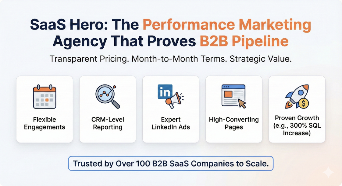
Capacity often blocks execution. Many B2B marketing teams have strong judgment but limited execution resources, with no in-house designers, no dedicated copywriters, and little time to test and iterate systematically.
Partner with SaaSHero to own creative, landing pages, and CRM-based optimization so your ads are built to convert instead of simply looking good.